









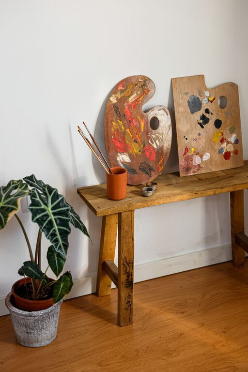
Creating a peaceful and relaxing environment in your home often starts with the colors you choose for your walls, furniture, and accessories. Calm colors can help reduce stress, improve mood, and make your living space feel more welcoming. Whether you want to refresh a single room or redecorate your entire home, picking the right calm colors is key. In this post, we’ll explore tips and ideas to help you select soothing colors that perfectly suit your space.
Why Choose Calm Colors?
Calm colors are typically soft, muted shades that evoke feelings of tranquility and comfort. They can make rooms feel larger, brighter, and more open, which contributes to a soothing atmosphere. These colors are ideal for living rooms, bedrooms, bathrooms, or any space where you want to unwind and relax.
Some common calm color families include:
– Blues
– Greens
– Soft neutrals (beige, taupe, warm grays)
– Pastels (lavender, soft pinks, light yellows)
How to Choose the Right Calm Colors for Your Home
1. Consider the Purpose of the Room
Start by thinking about how you will use the space. For example:
– Bedroom: Soft blues, greens, or lavenders can promote relaxation and restful sleep.
– Living Room: Warm neutrals or soft greens can create a cozy yet calm setting for socializing or reading.
– Bathroom: Light blues or seafoam greens give a fresh, clean feeling reminiscent of nature.
– Home Office: Pale blues or gentle grays can help maintain focus while reducing fatigue.
Matching color choices to the room’s function helps maximize the calming effect.
2. Test Colors in Natural and Artificial Light
Colors can change dramatically depending on lighting conditions. To ensure your calm colors work well in your home, test paint samples on your walls and observe them at different times of the day – morning sunlight, midday, and evening artificial light.
Natural light tends to enhance cool colors like blue and green, while artificial light can sometimes warm up or dull certain shades. Testing allows you to pick a color that looks calm and inviting in all lighting situations.
3. Use a Color Palette That Balances Warm and Cool Tones
While many calm colors are cool-toned (like blue or green), adding warm neutrals can keep the space from feeling too chilly or sterile.
Try pairing:
– Soft blue walls with beige or cream furnishings
– Mint green accents with light wood furniture
– Pale gray backgrounds with touches of warm taupe or sand
This balance creates depth and visual comfort, making the room feel harmonious.
4. Keep it Simple with Monochromatic or Analogous Schemes
To maintain calmness, avoid clashing or overly bright colors. Instead, choose:
– Monochromatic schemes: Different shades and tints of the same color family (e.g., sky blue, navy, and powder blue).
– Analogous schemes: Colors that are next to each other on the color wheel (e.g., soft blue with light green and pale teal).
These combinations flow naturally and support a peaceful vibe.
5. Incorporate Natural Elements
Calm colors inspired by nature tend to have widespread appeal. Consider colors drawn from:
– Ocean blues and sandy neutrals
– Forest greens and earthy browns
– Soft sunset pinks and lavender skies
Using these colors along with plants, natural fibers, and wood helps you create a cohesive, serene environment.
6. Limit Bold or Highly Saturated Colors
Bright or saturated colors can be energizing or overwhelming, which is the opposite of calm. If you love a vibrant hue, consider using it sparingly as an accent. For example:
– A soft beige wall with a few navy blue throw pillows
– A pale gray room with an accent chair in muted coral
This approach lets you enjoy some variety without losing the peaceful feel.
7. Consider the Finish
Matte or eggshell finishes often look softer and more relaxing than glossy paints, which can reflect too much light and feel harsh. These finishes reduce glare and add to the soothing atmosphere.
8. Think Beyond Paint
Calm colors can be introduced through elements other than paint, like:
– Area rugs
– Curtains and upholstery
– Artwork and decorative pillows
This method is especially helpful if you want to experiment with color without committing to a full paint job.
Popular Calm Color Choices
Here are some crowd-pleasing calm colors you might consider:
– Soft Blue: Often associated with tranquility and stability, blue works well in bedrooms and bathrooms.
– Sage Green: A muted green with gray undertones that pairs nicely with wood and natural textures.
– Warm Gray: A versatile neutral that can feel both cozy and modern.
– Lavender: Gentle and uplifting, lavender adds a touch of softness to any room.
– Beige or Cream: Classic neutrals that provide warmth and light without overwhelming.
Final Thoughts
Choosing calm colors for your home is a rewarding way to create a soothing retreat from everyday stresses. By considering the room’s purpose, testing colors in lighting, balancing tones, and keeping your palette simple, you can select colors that help you feel relaxed and comfortable. Remember to incorporate natural elements and soft finishes to enhance the calm effect. With these tips, you’re well on your way to designing a peaceful and inviting home.
Happy decorating!